
The Poetry Foundation and Poetry Magazine Launch a New Brand Identity
CHICAGO, Sept. 28, 2026
Press Release Disclaimer: This is a press release distributed through the XPR Media network. It has not been independently verified by our newsroom.

The Poetry Foundation and Poetry Magazine Launch a New Brand Identity
PR Newswire
CHICAGO, Sept. 28, 2026
Developed in partnership with Pentagram, the rebrand is designed to carry Poetry and the Poetry Foundation into the future.
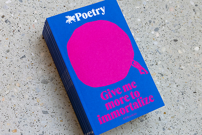
CHICAGO, Sept. 28, 2026 /PRNewswire/ — Following several years of organizational growth and creative collaboration, the Poetry Foundation reveals a new brand identity, starting with the October 2026 issue of Poetry magazine. The brand update features a vibrant, expanded color palette; bold typography; and, maintaining the spirit of Poetry’s original logo and the legend from which it sprang, a dynamic new Pegasus.
Foundation creative director Fred Sasaki led the rebrand in partnership with Andrea Trabucco Campos and his team at Pentagram, the world’s largest independent design consultancy. The Foundation and Pentagram first collaborated in 2016 when Michael Bierut was commissioned to redesign the brand for the Foundation and Poetry magazine. Recent conversations between Pentagram and the Poetry Foundation revealed a desire for greater range, expression, and play, and for a visual system that could move easily between the pages of Poetry, public programs and installations, grantmaking initiatives, and the digital experience. “We wanted an identity that could convey the full range of what we do and the vibrancy of poetry: big, bright, and beautiful in itself,” says Sasaki.
As the Foundation approaches its 25th anniversary in 2027, the new brand identity marks a moment of renewal: an opportunity to honor its history, create freedom for experimentation and articulation, and, in keeping with Harriet Monroe’s founding vision for Poetry, maintain the “Open Door” to the poetry of tomorrow.
Poetry Leads Design
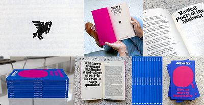
The bold brand updates are immediately clear in Poetry magazine. The now-familiar gridded “POETRY” stack introduced by Bierut’s influential design program featured a unique presentation of the word “poetry” that changed with each issue. The new design shifts the emphasis from “poetry” to poems themselves, pairing poem excerpts from the magazine with original illustrations.
“By featuring a poem excerpt on the cover of Poetry, we give readers a glimpse of the language, rhythm, and spirit inside each issue,” said Poetry editor-in-chief, Adrian Matejka. “I have loved the various cover designs of the magazine throughout my years as a reader and editor, and I’m excited to see where this new design takes us.”
The redesign maintains the physical character of Poetry: its iconic trim size remains unchanged, and it continues to be printed using sheet-fed offset. It also introduces more legible typefaces and maximizes space on the page while minimizing waste in the print specifications.
A Pegasus in Motion
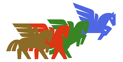
One of the most recognizable changes is the new Pegasus logo, which is designed to scale from spaces as small as the spine of Poetry to large-scale poetry installations. Pentagram developed four distinct and lively Pegasus poses: standing, rearing, one hoof raised, and in flight.
“Pegasus represents the source of all poetic inspiration, and we mortals transform its force into poetry; that’s why it has been Poetry‘s logo since 1912,” says Sasaki. “The Pegasus logo needs to be able to live quietly on a magazine spine and then become something monumental in a public space. The different poses give it a sense of character and movement while keeping it unmistakably ours.”
From the Page to the City
The new identity is designed not only for the Foundation’s digital platforms and Poetry, but also for the physical world. Fresh environmental graphics will extend the visual language into programs, installations, partnerships, and on the facade of the Foundation’s home in Chicago’s River North neighborhood.
This expansion reflects the Foundation’s desire to move poetry beyond the page and into the places where people live, work, gather, and move through Chicago. From public poetry installations and street-level graphics to partnerships throughout the city, the new identity creates a visual framework for poetry to become part of the built environment.
New Identity at a Glance
The rebrand results in an identity with a clear point of view and room to move—one that recognizes the Poetry Foundation and Poetry magazine’s history while embracing experimentation, surprise, and the many forms poetry can take. It includes the following:
- New visual marks, including four Pegasus logos and a range of Poetry Foundation and Poetry magazine wordmarks and lockups
- Expanded color palette offering greater range
- New and expanded typographic system:
- Print: Times Modern, Times Gothic, Delusse
- Institutional: Times Modern, Times Gothic, Pegasus
- Website: Times Modern, Times New Roman, Noto Sans, Noto Serif
- Redesigned Poetry magazine, including poetry excerpts on every cover
- New environmental graphics for the Poetry Foundation building and public poetry installations
- Expanded creative assets across digital, social, editorial, and institutional platforms
- New merchandise, including a limited-edition tote, notebook, and broadside
The new identity will continue to roll out across the Poetry Foundation’s digital properties, physical location, and Poetry magazine throughout fall 2026.
About the Poetry Foundation
The Poetry Foundation transforms lives through the power of words. Our work aims to amplify poetry and celebrate poets by fostering spaces for all to create, experience, and share poetry. Follow the Poetry Foundation and Poetry magazine on Bluesky, Facebook, Instagram, and LinkedIn.
 View original content to download multimedia:https://www.prnewswire.com/news-releases/the-poetry-foundation-and-poetry-magazine-launch-a-new-brand-identity-302891644.html
SOURCE Poetry Foundation


